Webinars
Check out our upcoming
Tutorial Videos
Check our videos and find out what makes us different
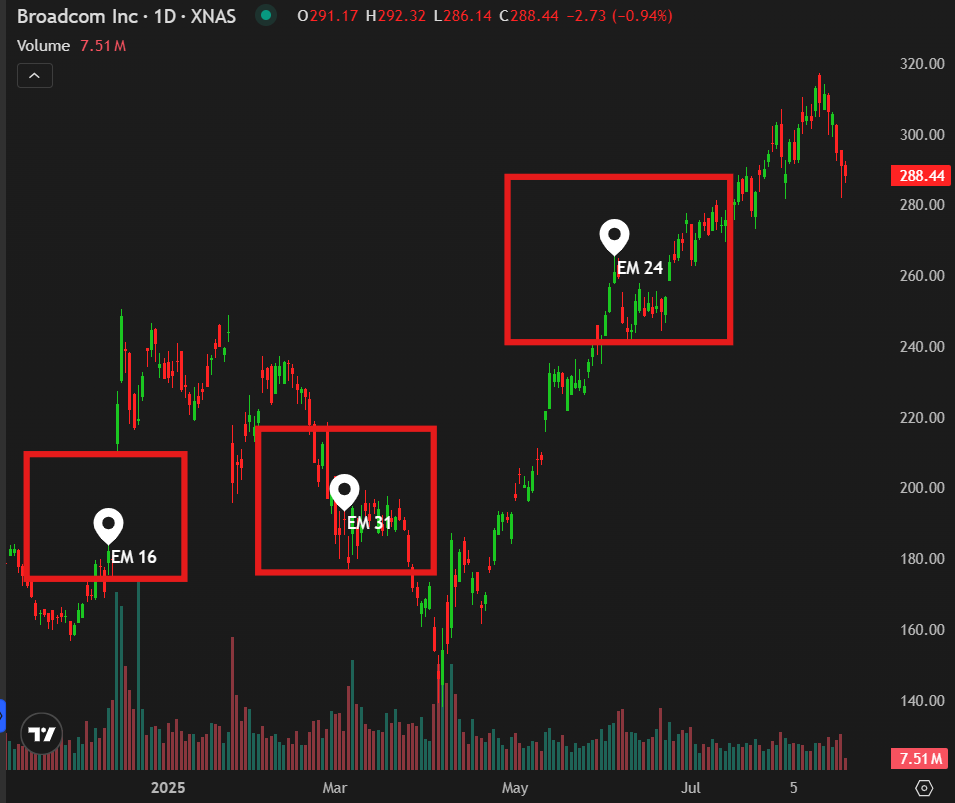
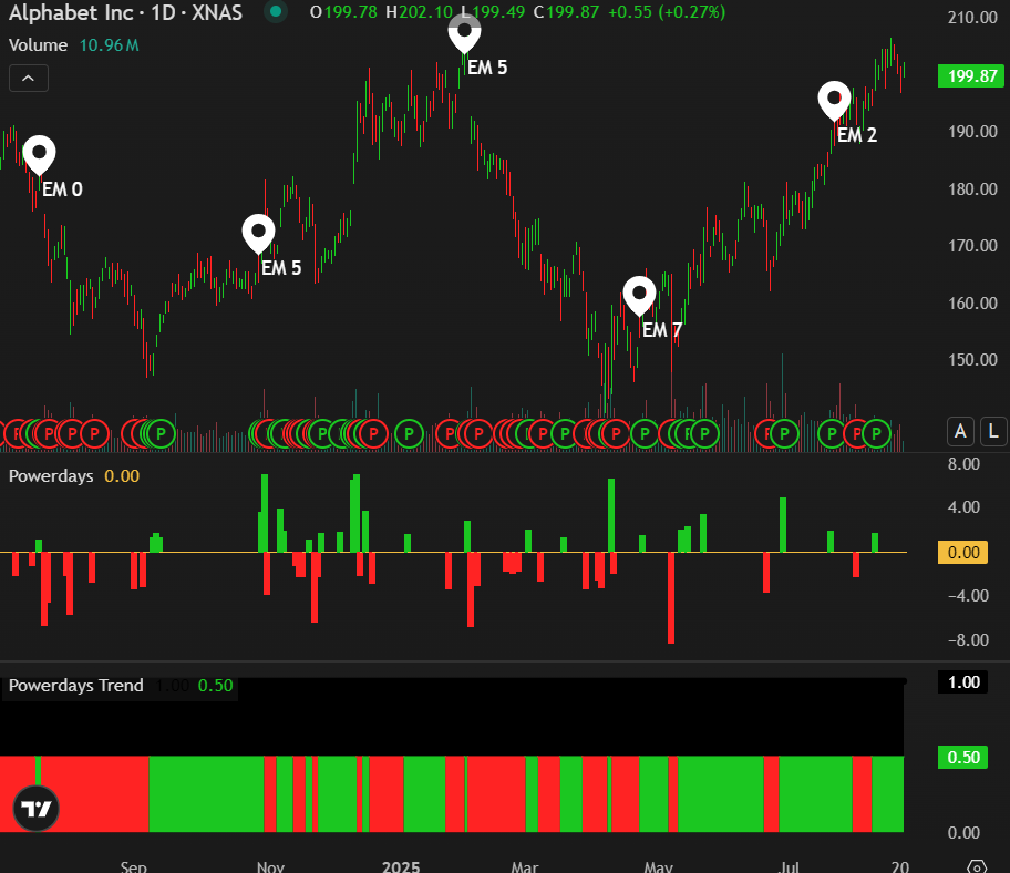
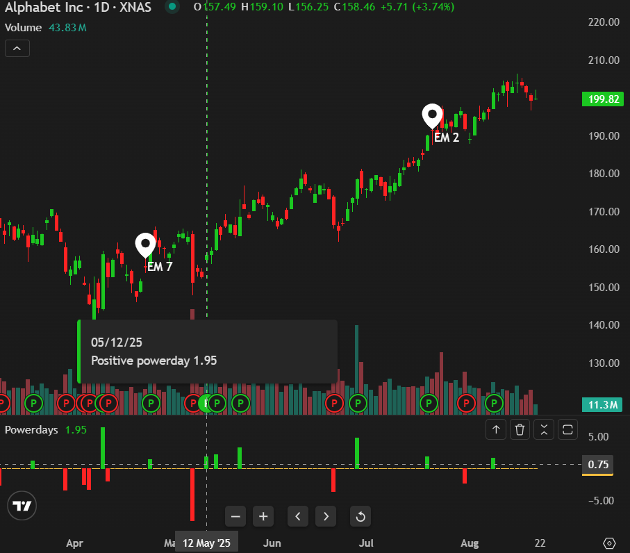
Earnings Momentum EM Score
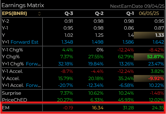
EM (Earnings Momentum) Score is derived from a proprietary model initially built in 2019. The Scores are based on quarterly non-GAAP year-over-year changes and are presented as numerical values. These values are raw scores. While they are not normalized, ranked into percentiles, or scaled relative to other stocks, they are adjusted for seasonal trends. This gives the EM score an “independence” from any other market metrics or peer progression.
The EM Score shows right on the chart of each stock at their earnings date
The formula to calculate EM Score gives a slightly higher weighting to reported revenue than reported earnings-per-share. This is because sales is an objective metric uninfluenced by one-time accounting adjustments and gains or losses that result from recognizing otherwise extraordinary items.
Our model attributes a high EM Score to companies that have revenue and earnings growth ranging from 17% to 20%. It attributes negative “points” to companies that have reported previous negative quarters, have decelerating earnings, or that report an abnormally weak quarter compared with the same prior-year period.
The model has been improved to now include profit margin and free cash-flow (growth/contraction, acceleration/deceleration, trend continuation or break in trend). Although not evenly weighted, EM Score has been broadened to take into account the financial health of a company and its ability to potentially return capital to shareholders.
Revenue, earnings-per-share data, gross margin and free cash-flow are continually analyzed using the most recent twelve fiscal quarters. This information populates a predictive statistical model against which current-quarter data is compared to arrive at the most recent EM Score.
Earnings Momentum Score rests on a continuum from -50 to +50 based on the strength of these inputs. A score above +20 indicates that both earnings and sales are accelerating.
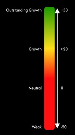
A positive EM Score is a great starting point to use for potential consideration and the higher up the scale, the stronger a company is performing. Stocks at or above 20 are truly unique and likely to be in heavy demand by investors.
Stocks with negative EM Scores are likely worth avoiding for now as much stronger alternatives are available.
Timing Momentum
There are 5 proprietary signals that encompass Timing Momentum and can be found in the advanced Chart component as seen below
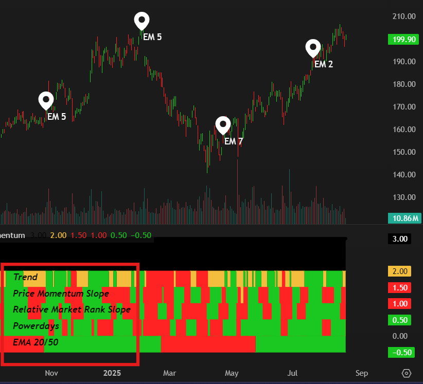
When Timing Momentum is selected as seen above, all 5 TM Indicators appear and are clearly labelled underneath the chart. All 5 Indicators are explained below:
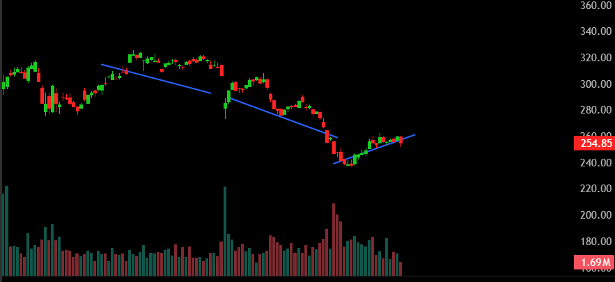
Trend Signal - This is a short-term trend signal that uses Average True Range and the distance to the stock’s 20 day Moving Average. This indicator which we calculate every 15 minutes shows the stock in one of three states. Green - Up Trend, Red- Downtrend, Yellow - Oscillating. The latest Signal is furthest to the right and its trend history can be seen over time and should be viewed in tandem with the price chart.
Price Momentum Slope - This indicator measures the rate of change in a stock’s price over a specific period (10 Days). Green - Uptrend, Red - Downtrend.
A positive slope indicates upward price momentum (price is increasing over time).
A negative slope indicates downward price momentum (price is decreasing).
The steeper the slope, the stronger the momentum.
Relative Market Rank Slope – The Relative Market Rank is a proprietary indicator that captures the performance of a stock versus all top 5000 stocks, over 12 months, 6 months and 3 months and 1 month, and ranks them to capture relative price performance. The RMR Slope measures the rate of change and the incline of the slope which we calculate using over a specific period (10 Days) shows the direction and strength/weakness of the trend. Green - Uptrend, Red - Downtrend
Powerdays – The Powerday Indicator, built from our proprietary model, is a powerful tool to identify stocks with significant short-term potential and critical market turning points.
The model pinpoints “major days” when a stock experiences abnormal trading activity (major stock volume at higher or lower values) and a sharp price move (up or down). Green - Positive, Red - Negative
Powerdays are rare but when they come, they are significant and are signalling major players buying or selling the stock in a heavy fashion.
See Powerdays for more…
EMA 20/50 – This is a simple price momentum ratio and helps traders and investors assess momentum, trend strength and potential reversals. Dividing a stock’s 20 day Exponential Moving Average (EMA) by its 50 day EMA creates a ratio that provides insight into the stock’s short term price trend relative to its longer term trend.
Ratio Interpretation. Green – Uptrend, Red - Downtrend
>1: The 20 day EMA is higher than the 50 day EMA, indicating the short term price is greater than the longer term average. This suggests bullish price momentum or an uptrend.
<1: The 20 day EMA is lower than the 50 day EMA, indicating the short term price is below the longer term average. This suggests bearish price momentum or a downtrend as recent prices are weaker.
=1: When the 20 day and 50 day EMAs are equal, the trend signal is neutral and suggests a period of price consolidation or a transition point where the stock may be deciding its next move.
Timing Momentum (TM) is a vital tool for investors to decide when might be the optimum time to enter or exit a stock position. If all indicators are Green, the conditions for entering a position look strong and the reverse if all indicators are red.
Timing Momentum has not been designed to give you a one and only “Buy or Sell” signal, quite the contrary since we believe that someone's “Buy signal is someone else's Sell one”. Every investor has a different view of the market, their objectives and horizon as an investor and their risk tolerance. Some like buying low, others buy higher, some look for low volatility and quiet periods with no momentum to invest, others wait for a rally and a confirmation to “Jump in” . TM allows each and everyone to rely on 2, 3 or 5 of theTM components, whether they are looking for price momentum, confirmed trend or Relative Strength.
Powerdays
Powerdays are abnormal market-activity-days where major shifts in price and volume occur for a stock. It often signals the beginning of a battle between buyers and sellers and or a major turn around in the trend of a stock.
The Powerday Model is a powerful tool to spot stocks with significant short-term potential and identify critical market turning points. Here’s how it works and why it matters:
- What It Does: The Powerday Model pinpoints “big days” when a stock sees unusual trading activity (lots of shares traded at a high value) and a sharp price move (up or down). These days are rare but signal major events—like earnings surprises, takeover rumors, or market-moving news—and represent a “bull and bear fight” in the market. Powerdays often come in series (e.g., over two or three days, with a mix of positive and negative days), and the final day’s outcome determines the stock’s next trend.
- How It’s Calculated: The model is based on Abnormal Trading Volume or ATV and tracks two metrics: trading value (volume × price) and price change. It measures the abnormal range of how extreme these metrics are compared to the stock’s normal behavior. The Powerday value combines these scores, staying at zero on quiet days but spiking to high positive or negative numbers (e.g., 2, 3, or 6.6 in standard deviation) on significant days.
- What It Predicts:
- Positive Powerday: A high positive score signals heavy buying and/or a price surge, often predicting a rally in the days or weeks ahead. This aligns with the High Volume Return Premium, where research shows high volume and price gains lead to further increases.
- Negative Powerday: A high negative score indicates heavy selling and a price drop, suggesting further declines, especially if short-sellers are active, as confirmed by ATV studies.
- Series and Trend Shifts: Powerdays often occur in clusters of days. These clusters reflect intense market battles, and the sign of the final Powerday defines the trend: a positive final Powerday means the bulls have won, signaling an upward trend or market turnaround, while a negative final Powerday indicates the bears prevail, forecasting a downtrend.
- Why It’s Useful: The Powerday Model cuts through market noise to highlight stocks with real momentum, warning signs, or trend-changing potential. Whether you’re chasing the next big winner, avoiding a falling stock, or looking for a market reversal, Powerday delivers clear, data-driven signals to guide your decisions. The Powerday Trend is the resulting Trend indicator of what the Powerday number has predicted a Positive or Negative trend.
- Market Context: The model works in all market environments—booming, crashing, or volatile—but its signals are strongest when aligned with the broader trend. For example, positive Powerdays in a bull market often lead to bigger rallies, while negative ones in a bear market warn of deeper trouble. In volatile markets, a series of Powerdays can signal a break in the current trend, helping you catch new opportunities early.
By using the Powerday Model, you’re leveraging decades of financial research on Abnormal Trading Volume and the High Volume Return Premium, packaged into an easy-to-use tool that helps you stay ahead of the market and spot critical trend shifts.
Historical Financial Literature and Predictive Power
The Powerday Model is grounded in established financial research, particularly around Abnormal Trading Volume (ATV) and the High Volume Return Premium, which provide evidence for its ability to predict market regimes and trend shifts. Below, we summarize insights from Sources and their relevance:
- Abnormal Trading Volume (ATV):
- Source: Mingyi Li, Xiangkang Yin &Jing Zhao (2024) (European Journal of Finance, 2024).
- Key Finding: ATV, characterized by unusually high trading volume, is a robust predictor of stock returns and volatility. High ATV days often signal shifts in market regimes, such as momentum (following positive price moves) or reversals (following negative moves). The study highlights that ATV reflects informed trading or reactions to significant events, with short-selling amplifying declines on negative days.
- Application to Powerday: The model’s use of Z-scored trading value captures ATV, enabling it to flag days of intense market activity. Positive Powerday values align with bullish ATV events, predicting rallies, while negative values correspond to bearish ATV, forecasting declines. The model’s ability to detect series of Powerdays further enhances its capacity to identify trend-defining moments, such as market turnarounds.
- High Volume Return Premium:
- Source: “Stock Market Prices and Volumes of Sales” Charles C. Ying (Journal of Political Economy, 1966).
- Key Finding: Ying (1966) documented the High Volume Return Premium, where stocks with abnormally high trading volume tend to experience significant price movements in the short term, often continuing in the direction of the initial move. This premium is driven by increased investor attention and is particularly strong in bull markets or following positive news.
- Application to Powerday: Positive Powerday values reflect this premium, as high trading value paired with price gains signals strong bullish momentum. The model’s focus on extreme Z-scores ensures it captures only the most significant instances of this premium, improving its predictive accuracy for subsequent rallies.
- Investor Attention and Volume-Price Dynamics:
- Source: “Does investor attention affect stock prices? Evidence from a natural experiment” (Journal of Financial Economics, 2021).
- Key Finding: Spikes in investor attention, proxied by high trading volume and price movements, drive short-term price trends, particularly when positive. These attention-driven events often lead to momentum in the same direction, though negative shocks can trigger reversals or continued declines in bearish contexts.
- Application to Powerday: The Powerday Model’s combination of abnormal trading value and price movement captures these attention-driven dynamics. Positive Powerdays signal bullish attention shocks (e.g., strong earnings), predicting rallies, while negative Powerdays may reflect panic or negative news, forecasting declines. The model’s series-based approach—where the final Powerday defines the trend—aligns with the study’s findings on how attention shifts can establish new price trends.
- Market Regimes and Trend Shifts:
- The studies collectively highlight that abnormal volume and price movements are context-dependent, with predictive power varying across market regimes:
- Bull Markets: Positive Powerdays are more likely to predict sustained rallies, as investor optimism fuels the High Volume Return Premium.
- Bear Markets: Negative Powerdays may signal capitulation or continued declines, particularly when short-selling is prevalent, as noted in ATV research.
- Volatile Markets: Series of Powerdays are more common, reflecting intense bull-bear battles. The final Powerday’s sign provides a critical signal for trend reversals or new trend establishment.
- The model’s Z-score standardization ensures robustness across regimes, adjusting for stock-specific volatility and trading patterns, while its series-based trend detection captures market turnarounds or breaks in trend.
During a Powerday, market “Bulls and Bears” challenge one another. This confrontation can be brief or last for several days leading to a series of Powerdays and can be both positive or negative. The final Powerday usually determines the next pricing trend.
The model is based on Abnormal Trading Volume (ATV) and tracks two metrics: trading value and price change. It measures the abnormal range of how extreme these metrics are compared to the stock’s normal behavior. The Powerday value combines these scores, staying at 0 on quiet days but spiking to high positive or negative numbers ( e.g, 2, 3, or 6.6 in Standard Deviation) on significant days.
Positive Powerday – A high positive score signals heavy buying and/or a price surge which often predicts a rally for days or sometimes weeks ahead.
Negative Powerday – A high negative score indicates heavy selling and/or a price drop which suggests further declines and particularly strong if the stock is being shorted.
Series and Trend Shifts – Powerdays often occur in a cluster of days. These clusters reflect intense market battles and the sign of the final Powerday defining the subsequent trend.
The Powerday model cuts through the noise to highlight stocks with real momentum, warning signs or an upcoming change in trend. The model works in all market regimes: booming, crashing, volatile etc. but its signals are strongest when aligned with a broader trend. For example, Positive Powerdays during a bull market often lead to bigger rallies while negative Powerdays in a bear market warn of deeper trouble.
In volatile markets, a series of Powerdays can signal a break in the current trend helping the investor catch new opportunities early.
By using the Powerday Model, you’re leveraging decades of financial research on Abnormal Trading Volume and the High Volume Return Premium, packaged into an easy-to-use tool that helps you stay ahead of the market and spot critical trend shifts.
Relative Market Rank
The Relative Market Rank is a proprietary indicator that captures the performance of a stock versus all top 5000 stocks, over 12 months, 6 months and 3 months and 1 month, and ranks them to capture relative price performance.
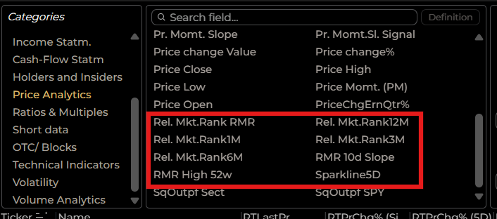
There are 5 RMR metrics
The Relative Market Rank 12 Months
The Relative Market Rank 6 Months
The Relative Market Rank 3 Months
The Relative Market Rank 1 Month
The Relative Market Rank RMR (Composite)
For each of them we calculate the performance of each stock and rank the selected stock among all 5000 other companies in the database.
So a stock that has a performance of 10% over 6 months and a RMR6m of 80, means that its 10% performance is greater than 80% of all the other stocks over 6 months.
The RMR composite is a weighted average of the 12, 6, 3, and 1 Month RMR. Which makes it a great indicator of the “overall” relative performance compared to other stocks.
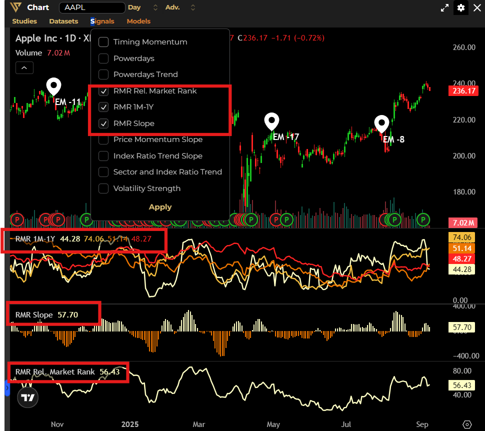
The RMR Slope measures the rate of change and the incline of the slope which we calculate using over a specific period (10 Days) shows the direction and strength/weakness of the trend. Green - Uptrend, Red - Downtrend
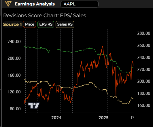
Revisions Score
Estimates Revisions by analysts are very often a Harbinger into the stock’s future performance. Sell-side analysts may revise their opinions, outlooks, and earnings estimates at any time in the 90-day period between company earnings announcements. Estimates Revisions can be infrequent and unannounced, they do not occur in concert or on a set or predictable timetable.This unpredictability makes data analytics difficult. Nevertheless, earnings revisions can be one of the most influential factors affecting stock price movement.
Additionally estimates for quarter or annual periods can move in opposite directions depending on the trend. With on average 8 quarters and 2 to 3 years predicted outward, that’s 10 to 11 different variables moving in up-and-down directions and updated at an unpredictable cadence.
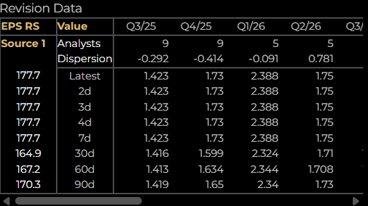
EPSMomentum is streamlining all of these into one single variable called the “EPS Revisions Score RS” and the “Sales Revisions Score RS” for sales estimates.
The EPSMomentum algorithm records changes in estimates and quantifies them to produce a one-of-a-kind Revision Score. Our Revision Score reflects net positive or net negative changes to the mean earnings estimate of all published sell-side analysts.
The EPSMomentum algorithm does not average changes in analysts' estimate revisions. We score each change based on a proprietary algorithm to come up with an aggregate revision score. The percent change represents how our Revision Score has changed since the last Earning Day.
Revision Score reflects the weight, scale, and number of changes to estimates. It measures the magnitude of changes analysts make to their forward earnings and sales estimates. A negative score reflects net deterioration. A positive score reflects a net increase. A 0 score signifies that any revisions published during the quarter have not changed the mean.
Positive earnings estimates alone do not create a positive percent change in the Revision Score. Earnings and sales must be in an accelerating state for the score to rise and the percent change to increase.
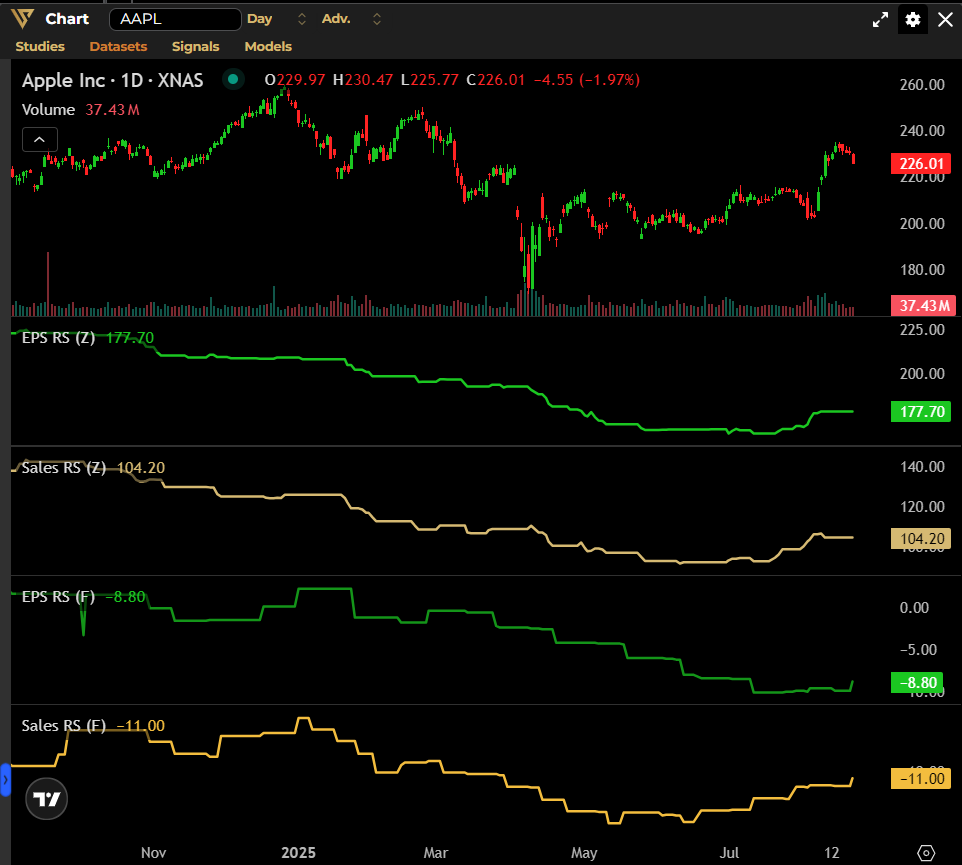
We use two different sources of estimates :
- Zacks Financial sourced estimates composes RS Z
- Finnhub sourced estimates composes RS F
The Revision Score provides a clear indication of analysts’ perception of a company – and its growth prospects – are evolving over time. A positive sloping Revision Score graph means that analysts’ believe that a company’s earnings are expected to rise.
Dark Short
Off exchange volumes are reported by Brokers and Market Makers to Finra on a daily basis. They are called “Dark pool Flow” traded “in the dark” “off exchanges” on platforms used by sell-side companies to cross trades between two counterparties.
OTC Shorts or Dark Shorts are of another kind, Brokers and Market Makers are by law obligated to report their “Naked” shorts to Finra. Short positions or either “Naked” or “Natural”, when they are Natural the broker is selling to a buyer and owning the shares. When they are “Naked” the Broker does not own the shares and still sells them short.
These “Naked shorts” are sold to Asset Management Companies and Hedge Funds (Buy-side firms) which means that these firms are “Long” or “Buyers” of the stock.
These “short sales” are viewed as a positive indicator because they represent purchases of institutional investors, meaning Real Buys from major Buy-side firms.
An increase in the Dark Short volume over the average volume traded 20 days is a potential major “Bullish” signal. Showing us that Hedge funds and Buy-Side firms are buying the stock off-exchange in size.
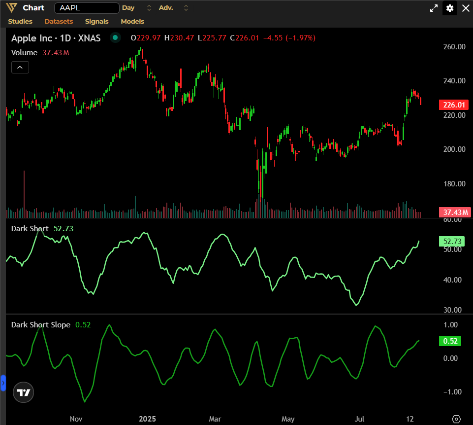
The Dark Short is shown on this chart and its associated “Slope” : the 10 day slope direction of the dark short.
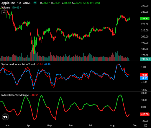
Index and Sector ratios
The index and Sector ratio are two useful indicators to assess the outperformance of a stock against its Sector and Index.
The Sector in Red and the Index ratio in Blue in the chart oscillate and highlight and over or underperformance of the stock. Sometimes the Sector underperformance comes first, then the index.
The Second Sub-chart shows the Slope of the Index trend. This is a leading indicator of this under/over-performance. These variables are available in the screener for you to filter on stocks that only make the cut.
Volatility Strength
The Volatility strength indicator is an expression of the “average” volatility that a stock would be experiencing. Based on a blend of short Average True Ranges, the Volatility Strength identifies Weak, Normal and Strong “regimes” of volatility. The Average True Range at 3 and 9 days are used respectfully. The average of both numbers is taken and then percentile-rank the average over 90 days. The lowest rank is 0.1 and 1 is the highest.
Finally, we re-represent these values on a simple scale of -0.5 (min) to +0.5 (max) and record the oscillations of its price volatility.
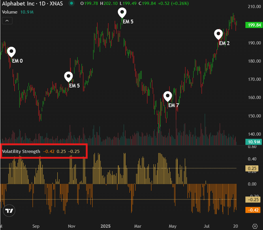
A Strong regime is a sign that the trend is “supported” by volatility, think of it as power. If the stock is in a downtrend and the volatility is high, this supports the trend significantly downward.
A Weak regime is usually the “Calm before the Storm” , a quiet low volatility period which is directionless and very often right before a major break. Or if there is a clear trend, that effort is weakening and ready for a change of trend or a major turn around.
A Normal Volatility regime is a transition period between extremes.
Price Slope analysis
The Screener is very powerful and can produce some interesting filters.
The Price Slope Field comes in 4 flavors : Today, 10 days ago, 20 days ago, 60 days ago. And for each, several slope lengths are available - 5d, 10d, 20d, 40d, 60-days length.
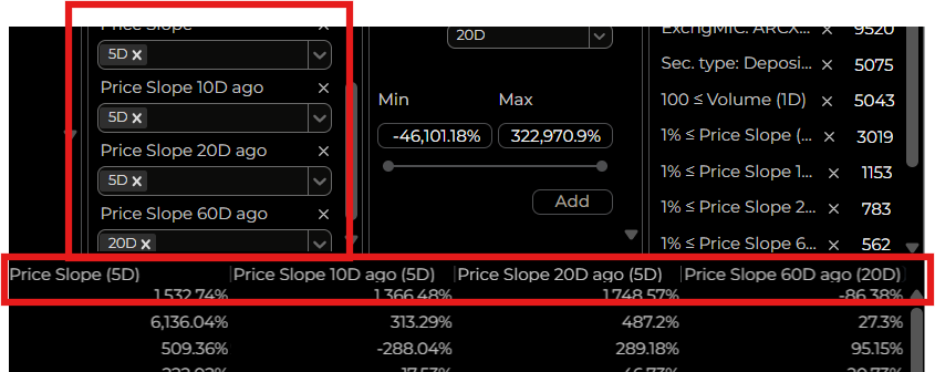
As a reminder, the slope is the regression line between points on a curve. A 10 day slope is the 10day regression line at a given point. For example, you can tailor your filters at points 60 days ago, 20 days, and today to look for “Greater than 5%” on each of ten 10 days slopes. The result will be a straight line up
For example:
If you set the Price Slope 60d ago (20 day slope) <-10%
If you set the Price Slope 20d ago (40 day slope) < -5%
And If you set the Price Slope (now) (20 day slope) > +5%
You will get stocks that have collapsed then turned around and are achieving a +5% performance now.
This tool gives you the ability to “draw” the type of chart you are interested in and the screener will produce all stocks matching these conditions
Post Earnings Announcement Drift
Post Earnings Announcement Drift (PEAD) is a well-documented financial anomaly and a financial phenomenon where a stock’s price continues to move in the direction of an earnings surprise (positive or negative) for week’s or even months after an earnings announcement. When a company reports earnings that significantly beat or miss analyst expectations, the stock often experiences an initial price reaction, but the price then “Drifts” in the direction of the “beat or miss” over time rather than adjusting immediately.
PEAD suggests markets are not fully efficient as prices do not fully reflect all available information. Investors may underreact or overreact to fresh data leading to a gradual incorporation of the information. The Drift can persist for 1-3 months until fresh data is released by the company or new research is produced by analysts. Research suggests that “abnormal returns” can be made during this period with stocks in the top decile of earnings surprises outperforming those in the bottom decile by 3-5% in the subsequent quarter.
What is PEAD in financial literature?
Post-Earnings Announcement Drift (PEAD), also known as the Standardized Unexpected Earnings (SUE) effect, is one of the oldest and most persistent capital market anomalies, first identified by Ball and Brown in 1968. It describes the tendency for a stock’s abnormal returns (returns exceeding market expectations) to continue drifting in the direction of an earnings surprise—positive or negative—for weeks or even months after an earnings announcement. This drift challenges the efficient market hypothesis, which assumes that new information, such as earnings data, is immediately reflected in stock prices.
Research, including Bernard and Thomas (1989, 1990), highlights that PEAD occurs because investors underreact to the implications of current earnings for future earnings, leading to a gradual price adjustment. Notably, a significant portion (25-30%) of the drift concentrates around the three subsequent quarterly earnings announcements, despite these periods representing only about 5% of trading days.
How the EPSMomentum PEAD Model Works
Our EPSMomentum PEAD Model refines the traditional PEAD framework by focusing on the immediate market reaction within the first 24 hours after an earnings announcement and leveraging this to forecast price movements over the next 90 days. Unlike the broader PEAD concept, which tracks cumulative abnormal returns over extended periods, our model uses a narrow window to define four market configurations based on two key variables:
- Premarket/After-Hours Price Movement:
- For earnings announced Before Market Open (BMO), we measure the price change in premarket trading.
- For earnings announced After Market Close (AMC), we measure the price change in after-hours trading.
- This captures the initial market reaction to the earnings surprise.
- Regular Trading Session Price Movement:
- We measure the price change during the next regular trading session (e.g., the day after an AMC announcement or the same day for a BMO announcement).
- This reflects how the market adjusts to the initial reaction.
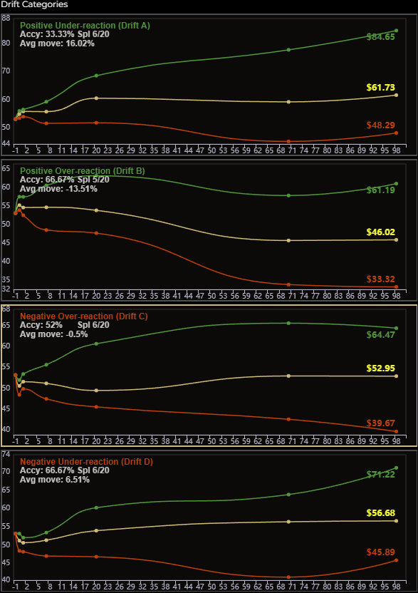
These variables define four PEAD configurations, each indicating whether the market underreacts or overreacts to the earnings announcement:
- A - Positive Under-reaction:
- The stock rises in premarket (BMO) or after-hours (AMC) trading and continues to rise in the next trading session.
- Interpretation: The market views the initial upward move as insufficient, confirming the positive earnings surprise, leading to a sustained upward drift.
- B - Positive Over-reaction:
- The stock rises in premarket (BMO) or after-hours (AMC) trading but falls in the next trading session.
- Interpretation: The market considers the initial upward move excessive, prompting a short-term correction, but the positive earnings surprise still drives a gradual upward drift.
- C - Negative Over-reaction:
- The stock declines in premarket (BMO) or after-hours (AMC) trading but rises in the next trading session.
- Interpretation: The market views the initial downward move as excessive, leading to a short-term rebound, but the negative earnings surprise typically results in a gradual downward drift.
- D - Negative Under-reaction:
- The stock declines in premarket (BMO) or after-hours (AMC) trading and continues to decline in the next trading session.
- Interpretation: The market sees the initial downward move as insufficient, reinforcing the negative earnings surprise, leading to a sustained downward drift.
Methodology and Price Projections
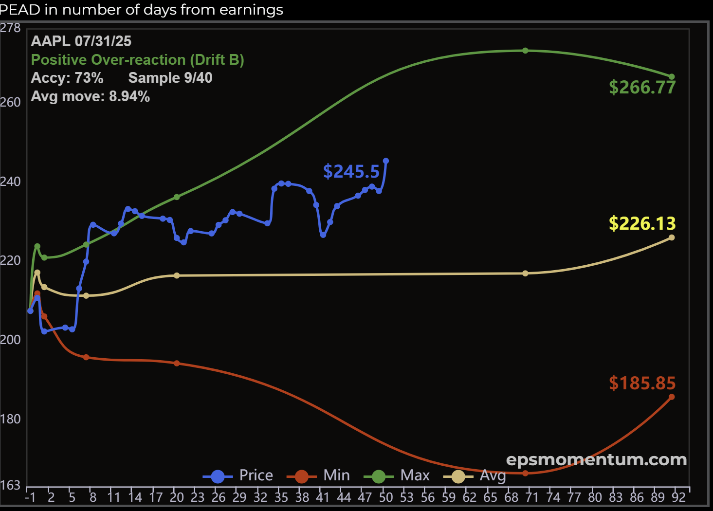
The EPSMomentum algorithm generates a statistically accurate predicted average price path for a stock over the next 90 days based on:
- Actual Price Move: The first 24 hours of trading broken down in two components the pre/post session and the market-hour-one
Using the identified PEAD configuration (A, B, C, or D), the model calculates:
- Mean Price Projection: The expected average price path over 90 days.
- Maximum and Minimum Projections: The upper and lower bounds of the price range.
- Standard Deviation Bands: Positive and negative 1 and 2 sigma ranges, providing a statistical measure of price volatility around the mean projection.
The model monitors the spread between the stock’s current trading price and its predicted average price, updating this data daily and presenting it graphically in a color-coded format. This visualization highlights opportunities where the stock is trading above or below its predicted drift curve, enabling investors to act on mispricings.
Predictive Insights and Market Dynamics
The EPSMomentum PEAD Model leverages the underreaction and overreaction dynamics observed in PEAD research:
- Under-reaction (Configurations A and D):
- When the market underreacts, the initial price move (up for A, down for D) is deemed insufficient relative to the earnings surprise. Prices confirm the initial direction in the regular trading session and continue to drift slowly in that direction over the next few months as institutional investors digest the earnings data.
- Example: A stock with a positive under-reaction (A) rises after a strong earnings beat and keeps climbing as analysts revise forecasts upward.
- Over-reaction (Configurations B and C):
- When the market overreacts, the initial price move (up for B, down for C) is considered excessive, leading to an immediate adjustment in the opposite direction during the regular trading session. However, the earnings surprise still drives a gradual drift in the direction of the initial move over time.
- Example: A stock with a negative over-reaction (C) drops sharply after a weak earnings report but rebounds the next day, yet continues to drift downward as the negative surprise is absorbed.
These dynamics align with Bernard and Thomas (1989), who attribute PEAD to investors’ failure to fully incorporate current earnings’ implications for future earnings, resulting in a delayed price adjustment.
How can you use this?
As an investor, the EPSMomentum PEAD Model is your go-to tool for capitalizing on one of the market’s most reliable patterns: the tendency for stocks to drift in the direction of an earnings “surprise”. Here’s how it works and why it’s valuable:
- What It Does: The PEAD Model analyzes a stock’s price movement in the first 24 hours after an earnings announcement—covering premarket or after-hours trading and the next regular trading session. It uses these movements to identify one of four market configurations (Positive Under-reaction, Positive Over-reaction, Negative Over-reaction, or Negative Under-reaction) and predicts the stock’s price path over the next 90 days.
- How It Works: The Model uses actual and historical price action to generate a statistically accurate price forecast. It calculates:
- The expected average price (mean projection).
- The maximum and minimum price ranges.
- Confidence bands (±1 and ±2 sigma) to show the likely price volatility.
- Results are displayed in a clear, color-coded graph, updated daily, showing how the stock’s current price compares to its predicted drift path.
- What It Predicts:
- Positive Configurations (A and B): If the stock rises initially (premarket or after-hours), it’s likely to keep drifting upward over 90 days, especially if the market underreacts (A) and confirms the rise. With an over-reaction (B), where the stock dips the next day, the positive earnings surprise typically drops during the remainder of the quarter.
- Negative Configurations (C and D): If the stock falls initially, it’s likely to drift downward, particularly if the market underreacts (D) and continues the decline. An over-reaction (C) may see a short-term rebound that will often lead to a sustained climb.
- The Model also flags when drift is concentrated around the next three quarterly earnings announcements, where research shows 25-30% of PEAD occurs.
- Why It’s Useful: The PEAD Model cuts through market noise to identify stocks with strong drift potential, helping you spot opportunities for long-term gains or short-term trades. Whether you’re buying a stock poised for an upward drift or avoiding one headed for a decline, the tool provides clear, data-driven insights. The daily-updated graph lets you see if a stock is trading above or below its predicted path, signaling potential mispricings.
- Key Takeaways:
- PEAD is a proven market anomaly, and our EPSMomentum algorithm pinpoints stocks where it’s most prevalent.
- The PEAD widget shows the most likely 90-day price path based on the identified configuration, with color-coded visuals for easy interpretation.
- Use the Model to inform your strategy: buy stocks with strong upward drift potential, sell or avoid those with downward drift, or trade short-term mispricings around earnings events.
By leveraging the EPSMomentum PEAD Model, you’re tapping into decades of financial research and our proprietary analytics, giving you a powerful edge in navigating earnings-driven market opportunities.
Markets
The Markets component has been designed to give investors a top down view of the market landscape in a single view.
Benchmarks – There are a total of 16 US-listed ETFs that represent the major financial markets around the world starting with the United States and finishing with Australia. The display provides a selection of column listed below:
SparkL – This is a 5 day Spark line used to understand the 5 day price trend. Its color is either Green or Red indicating up or down from the day‑1 closing price to the day‑5 closing price.
RTLastPr – The current real-time price.
RTPrChg%(SinceCl) – The current real-time change in percent from previous close.
RTPrChg% (5D) – The current real-time change in percent over last 5 days.
RTPrChg% (20D) – The current real-time change in percent over last 20 days.
PrChg% YTD – Price return year to date (YTD).
Max DD (1YR) – The maximum stock draw-down in percent for the last 12 months.
Trend – This signal is based on Average True Range (ATR) and distance to its 20-day moving average and identifies one of three regimes: Up, Down or Consolidating.
PM Signal – The short-term price momentum of the stock over the last 2 weeks. The signal is an expression of the stock’s acceleration using the ROC (Rate of change) using the 3 day and 9 day time periods both weighted and smoothed. There are two regimes: Up momentum and Down momentum
Pwday Trend – This is the current trend of the Powerday and falls in to one of 4 regimes:
Positive, Positive Pending, Negative and Negative Pending.
VolatSignal – This signal measures the price volatility regime the stock is in using the Average True Range at 3 and 9 days, respectively. The average of both numbers is taken and then percentiles rank the average over 90 days. The lowest rank is 0.1 and 1 is the highest.
Finally, we re-represent these values on a simple scale of -0.5 (min) to +0.5 (max) and record the oscillations of its price volatility.
There are a total of 3 regimes, Strong (Greater than 0.2), Normal (-0.2 to +0.2) and Weak (Below -0.2)
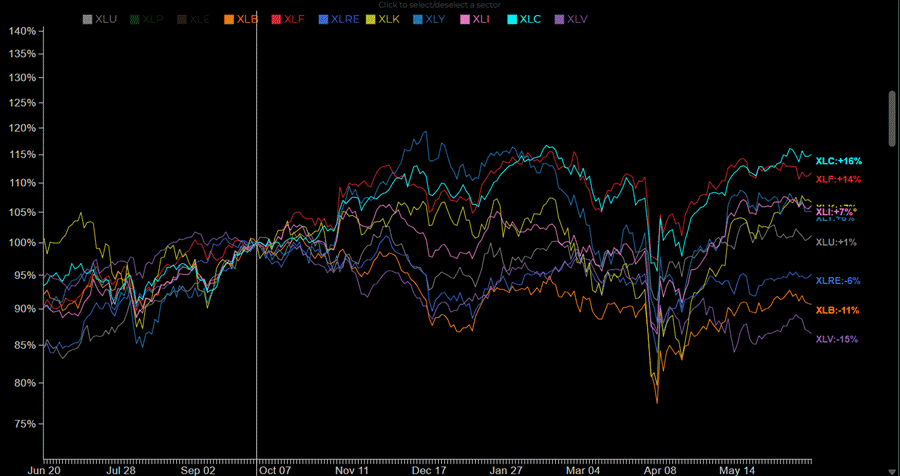
Sectors – There are a total of 11 Sector ETFs represented in the SPDR S&P 500 ETF Trust.
Each Sector ETF focuses on one of the 11 sectors identified by the Global Industry Classification Standard (GICS), which categorizes companies based on their main business activities. Investors use them for diversification, risk management, speculation, hedging, and rotating strategies to capitalize on economic cycles and market trends.
The Sector table fields are identical to the Benchmark section and designed to show current price levels, recent pricing history and what trend regime each sector is experiencing
The Sector Rotation section includes a display of each sector chart with the ability to filter on Price or its Ratio across 3 different time periods: 12 months, 60 days and 15 days.
Beneath the sector charts is the Normalized Sector Rotation Chart and the data populating the chart is determined by the time frame selected. The time range can be manipulated by manually moving the white vertical line forward and backwards to study relative performance over the user’s desired date range.
The default display automatically includes all 11 Sectors but these can be de-selected individually by clicking on the colored sector tickers above the chart.
The default display automatically includes all 11 Sectors but these can be de-selected individually by clicking on the colored sector tickers above the chart.
During risk off periods, stocks with stronger defensive characteristics ex. Financials, Utilities, Real Estate and Consumer Staples tend to outperform the broader market.
When the market is in a risk on period, growth stocks ex. Technology, Consumer Discretionary and Communication stocks tend to outperform.
Stock Scanners
There are a multitude of ideas generating Stock Scanners available on the platform.
The Fundamental Scanners draw not only from company reported data but also the numerous studies and proprietary data sets the platform generates. Users can quickly access a list of stocks where Earnings are accelerating to stocks that Wall Street’s analyst community currently favor. The “ Revision Winners” Scanner delivers a list of companies that have seen their Earnings forecasts revised upwards since their last reported quarterly numbers and reflected in the proprietary Revision Score calculation.
The Price Action Scanners give users rapid access to list of investment ideas where price, price trends, traded volume and value are the determinants between a selection of different time frames. Users additionally have quick access to many unique signals including Powerday Breakouts, Slope Trends and Abnormal Volume Scans.
Each Scanner produces a list of stocks for consideration and the scanners themselves can be accessed by simply selecting the highlighted prompts or using the Event and Universe field pickers available in their respective drop down menus.
The extensive list of Stock Scanners are accompanied with a full description next to the results and a detailed explanation of how they can be used.
Two very important proprietary Scanners are Earnings Momentum which produces a list of stocks ranked by their EM Scores and Timing Momentum which uses a combination of 5 proprietary indicators (mentioned above) to help users select an appropriate time to manage their entry and exit decisions.
All Scanners leverage the powerful Stock Screening tool available in the platform and are designed to give users a selection of ideas in real-time from a constantly changing market.
Stock Drift
Post Earnings Announcement Drift (PEAD) is a well-documented financial anomaly and a financial phenomenon where a stock’s price continues to move in the direction of an earnings surprise (positive or negative) for week’s or even months after an earnings announcement. When a company reports earnings that significantly beat or miss analyst expectations, the stock often experiences an initial price reaction, but the price then “Drifts” in the direction of the “beat or miss” over time rather than adjusting immediately.
PEAD suggests markets are not fully efficient as prices do not fully reflect all available information. Investors may underreact or overreact to fresh data leading to a gradual incorporation of the information. The Drift can persist for 1-3 months until fresh data is released by the company or new research is produced by analysts. Research suggests that “abnormal returns” can be made during this period with stocks in the top decile of earnings surprises outperforming those in the bottom decile by 3-5% in the subsequent quarter.
The PEAD analytic captures the initial market response to fresh earnings data and defines the initial price reaction into one of four configurations:
Drift A: Positive Under-reaction
Drift B: Positive Over-reaction
Drift C: Negative Over-reaction
Drift D: Negative Under-reaction